Sorry, Pantone. I just can't buy into "Serenity" (aka baby blue) and "Rose Quartz" (aka pale pink) as my color(s) of the year. These were the pasty choices made by the arbiter of fashion color for 2016.
Pantone pulled a fast one this year with its much-ballyhooed color selection by naming not one but two colors as the be-all and end-all of fashion for the coming year.
The firm notes that Serenity and Rose Quartz "demonstrate an inherent balance between a warmer embracing rose tone and the cooler tranquil blue, reflecting connection and wellness as well as a soothing sense of order and peace."
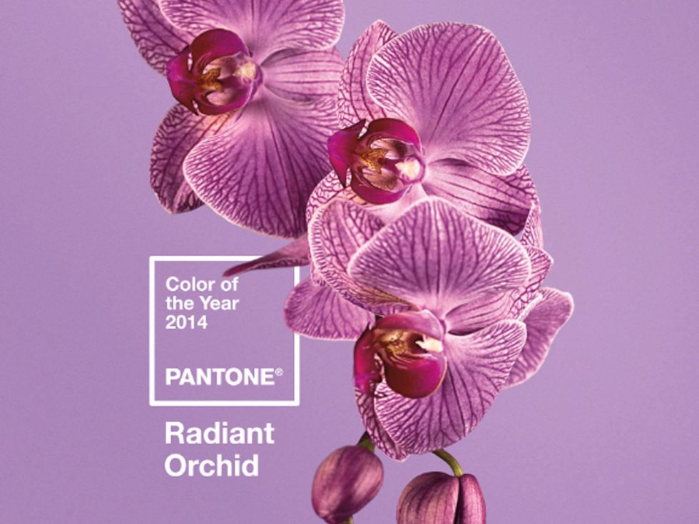
Well, I'm a jewel tone sorta gal, whose only pastel in the closet is lavender. I loved Pantone's Radiant Orchid (2014) choice and thought Marsala (2015) was intriguing. I'll be leaving the 2016 selections on the store shelves. Just too namby pamby for my fiery taste.
Beauty, of course, is in the eye of the beholder. And Pantone's did take a very thoughtful approach to the 2016 color selection.
"In many parts of the world we are experiencing a gender blur as it relates to fashion, which has in turn impacted color trends throughout all other areas of design," Pantone explained in its announcement. "This more unilateral approach to color is coinciding with societal movements toward gender equality and fluidity . . . "
Yes, the colors are already available from various fashion houses and in the Pantone website.
Describing the soothing colors as a way to counter stress, Leatrice Eiseman, executive director of the Pantone Color Institute, said in a statement, "Joined together, Rose Quartz and Serenity demonstrate an inherent balance between a warmer embracing rose tone and the cooler tranquil blue, reflecting connection and wellness, as well as a soothing sense of order and peace."
Still, I'd rather wear Radiant Orchid.
Rose Quartz is one of Pantone's two colors of the year for 2016.