Flying together
New United airline tweaks logo, keeps a piece of Continental, but whiffs ongoing bold
 What could have been — A blogger's version of a new combined logo based on SaulBass's design
 The fresh, new United: bold, blocky caps and Continental's wire globe
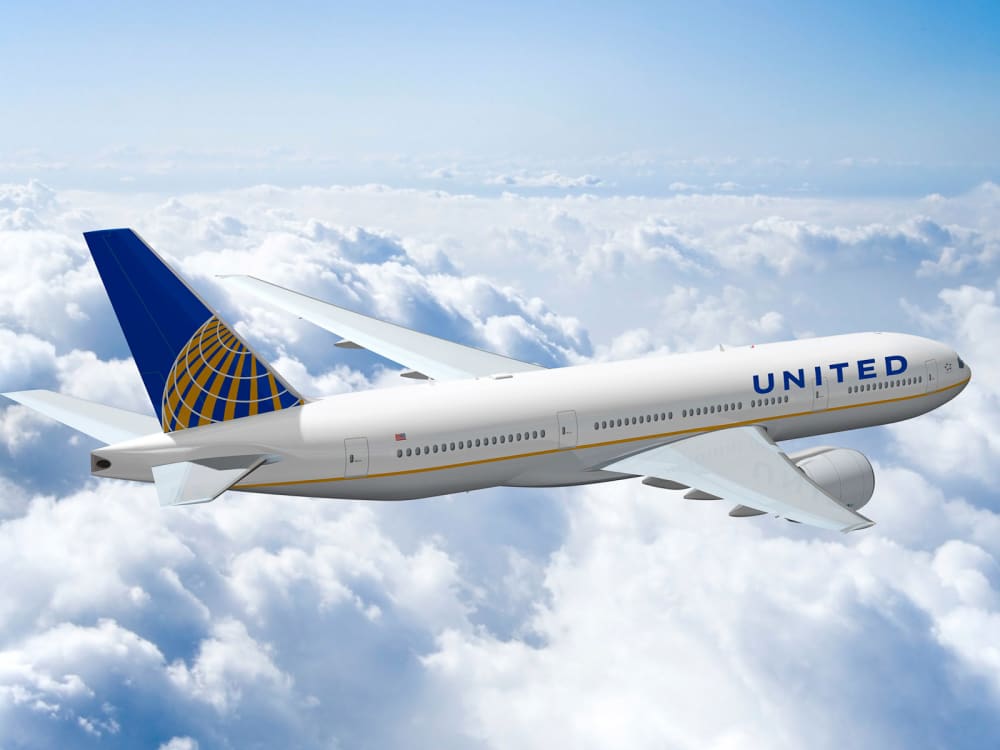
 The livery and colors from Continental will stay.Photo by Tammy Bryngelson
When the logo for the new United was unveiled after the merger with Continental in May, design snobs scoffed over the revised corporate symbol — in essence, the blue Continental serif logo and wire globe with only the names of the airlines swapped out.
After three months, the new United airline goliath has released its official logo — keeping the globe image (used by Continental since 1991) and replacing the dated 1990s serif text with sleek, bold, sans-serif capitals.
In an attempt to keep brand recognition of both airlines intact, United will also hold onto Continental's colors — cerulean blue, white and a hint of gold — on the airplane's livery, combined with the new United text.
The new font and color combo does indeed look more modern and less patched together — altogether more worthy of the world's largest airline.
But design connoisseurs note that the companies already had something in common — logos designed in the 1970s by the legendary Saul Bass.
While I don't dislike the new choice, I love the idea posted on branding and design blog Subjective Object to take Bass's red, swooping Continental logo, give it a tweak and a color update and make it an image of the united company with both style and a sense of history.

 Dinosaur Valley State Park. ttpwd.texas.gov/