Designed to Shine
HGTV pros honor Houston interior designer for Heights-area home with great curb appeal
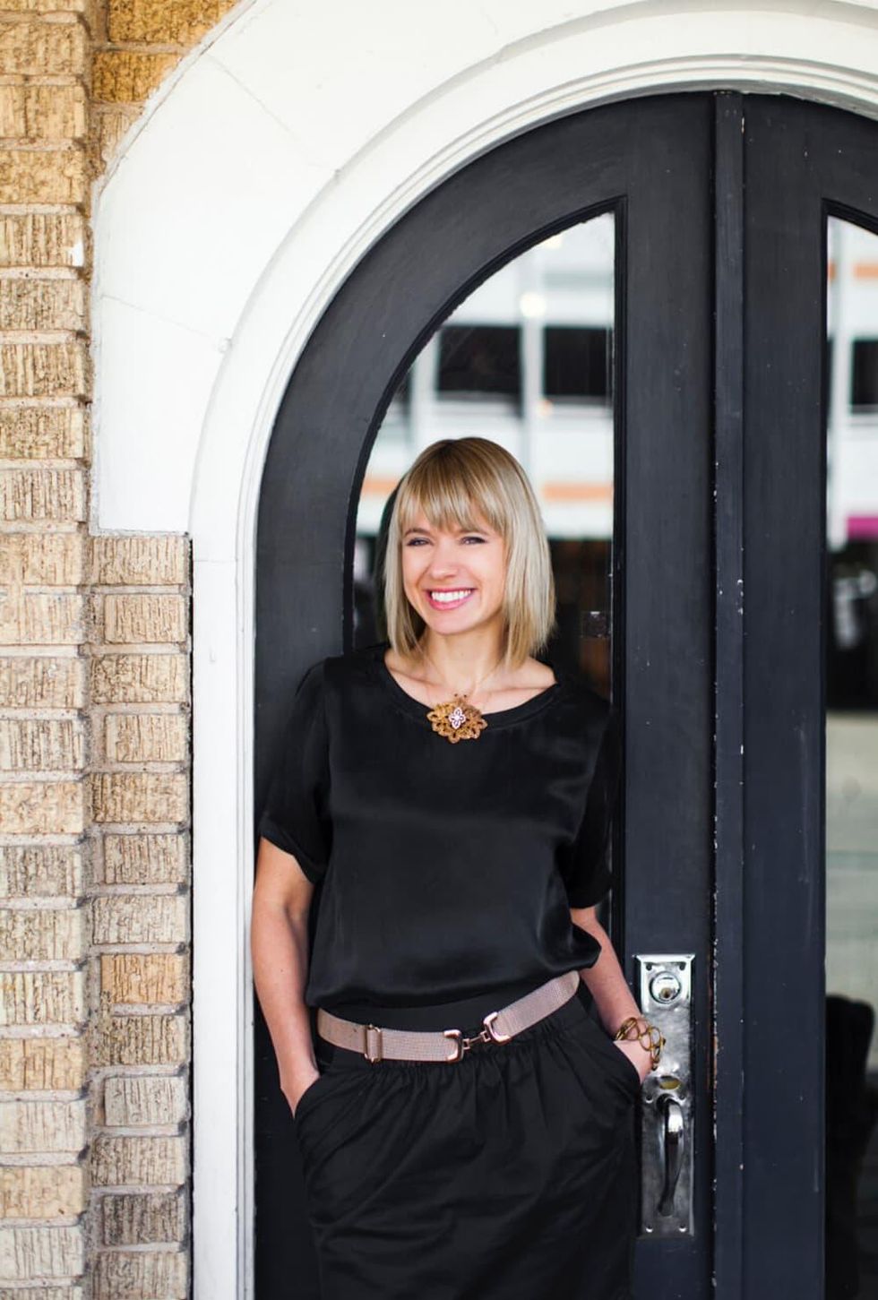
One of Houston's own has garnered a nod from the pros at HGTV when the winners of the 2016 Faces of Design Awards were announced. Gin Braverman, of gindesigns, whose previous projects include the rustic dining room at Oxheart, industrial-chic wine spot Camerata, the eye-catching geometrical motif at F Bar, as well as design concepts at nightclubs Boulevardier and The Commoner won the HGTV Editor's Pick for First Impressions, which focuses on a home's curb appeal and entry.
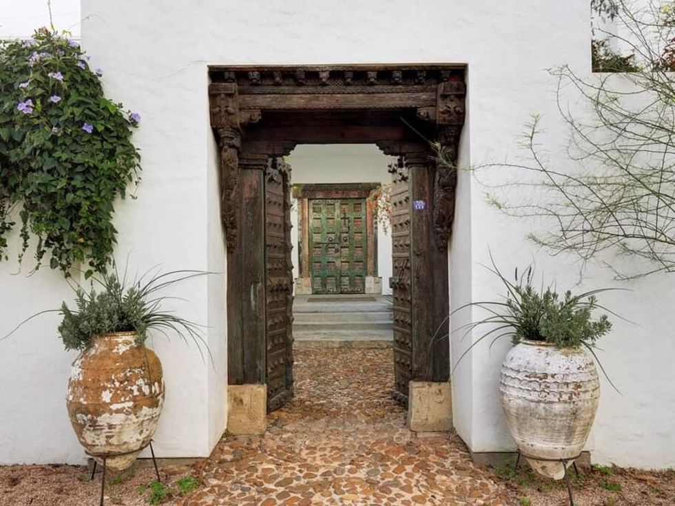
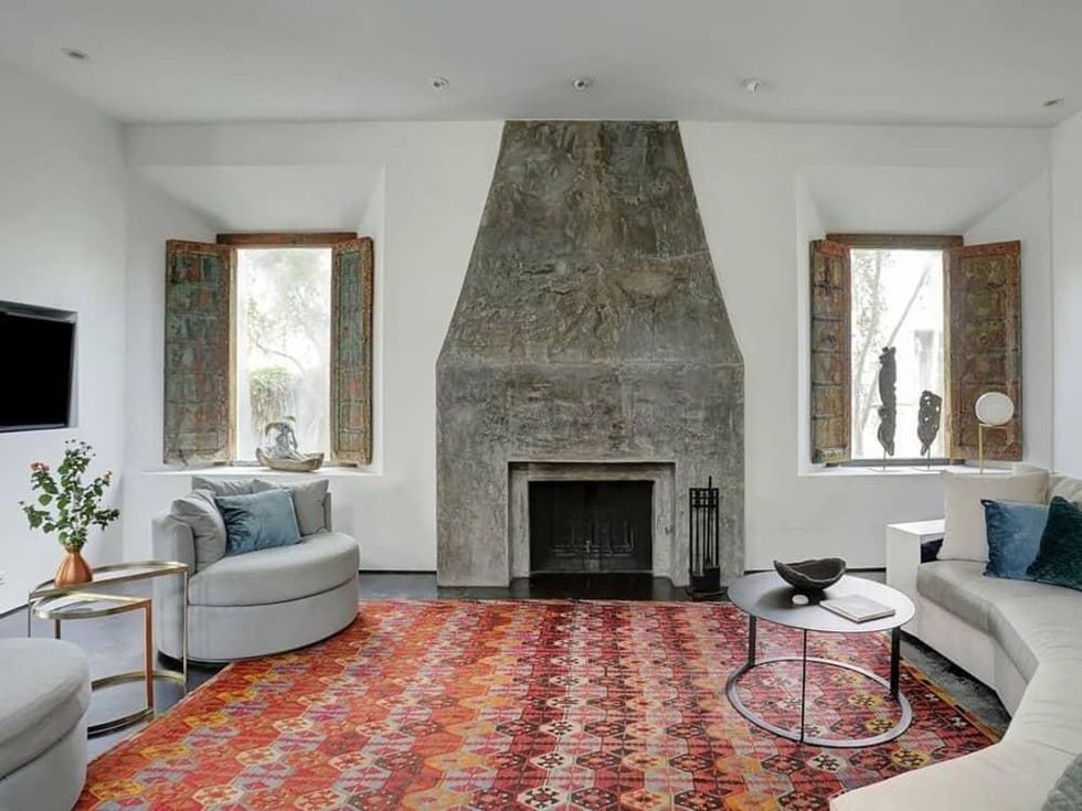
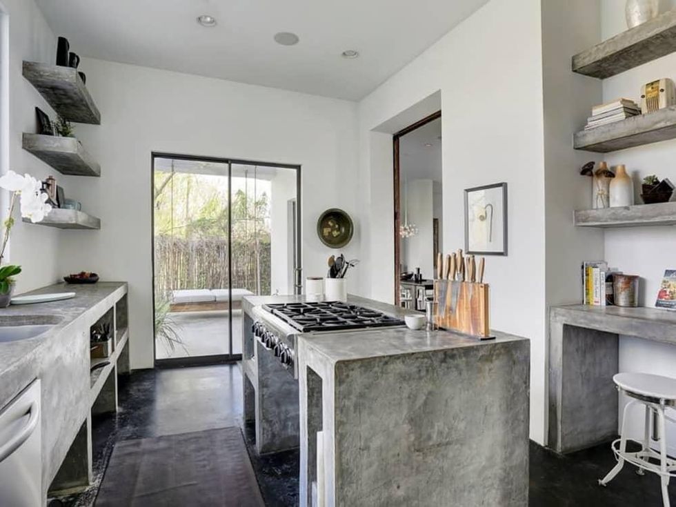
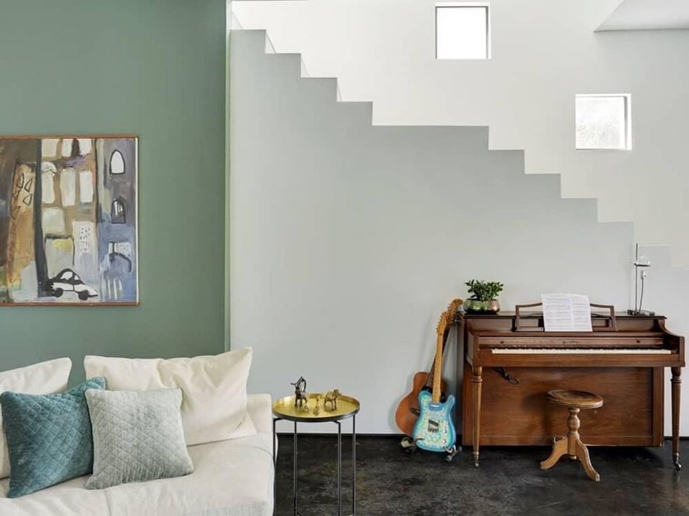
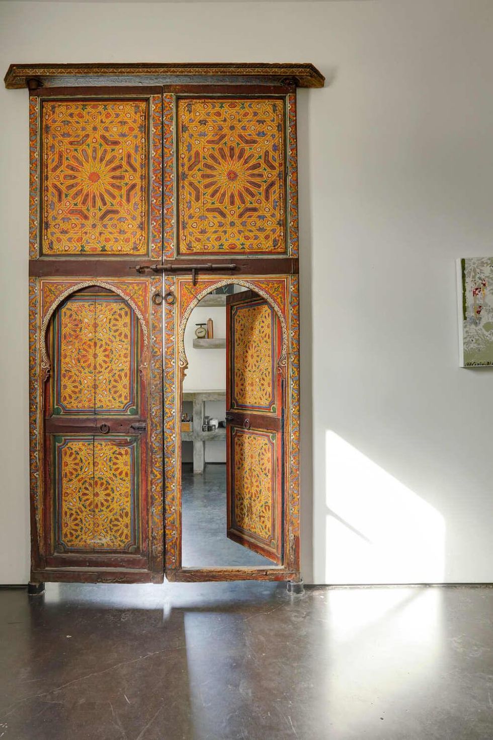
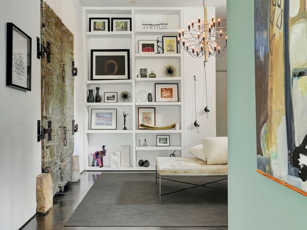
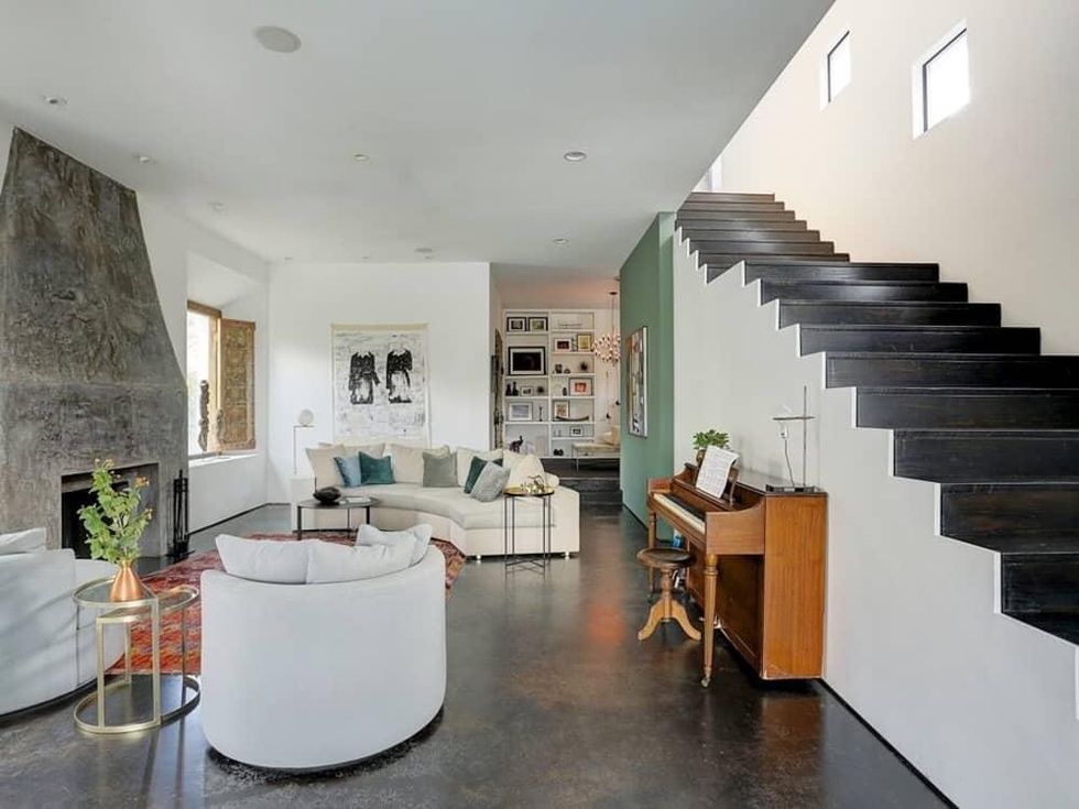
The Heights-area house is a study in subdued backdrops that showcase antiques and collectibles from around the world. The home's white, high-walled privacy enclosure features an entry of double doors recovered from an Indian temple. This regal yet simple entry leads to a landscaped pass that takes you to another set of ornate Indian double doors, which open into the airy home. A museum-quality austerity sets the tone, with clean white walls and a polished dark stone floor, the better to highlight the homeowner's architectural antiques from China, Africa, India and Mexico.
It's a busy time for Braverman, who also recently welcomed a new baby to her family. (We congratulate her on her sweetest new addition.) We talked to her about how she makes spaces great. Here's what she said:
CulturemMap: You've said that your designs tell the story of a space. What was the story you were telling with this home?
Gin Braverman: The homeowners took such care to create a home with the perfect balance of modern and rustic architectural elements. We wanted to continue that balance in the furnishings and decor, and I feel we achieved that with the use of antique rugs and decorative objects mixed with textured fabrics and clean lines in the custom furniture.
CM: Can you give us some tips on incorporating collected items into the interior design of our homes?
GB: Buy what you love and don't worry about it too much. You can always tie pieces together; for example, you can use coordinating frames, or organize a collection of found objects on a shelf that creates a cohesive backdrop.
CM: You spent time working in Taipei; can you talk about how that influenced and informed your understanding of design from an American standpoint? I.e., how do the two compare, generally?
GB: My time in Taipei was very important in developing a more global perspective on design. Trends seem to work their way west and Taiwan was a very cool crossroads-type of place in which the clean, modern styles that have been popular in Japan share the stage with the more ornate and embellished high-end decor that the Chinese tend towards. It was very rare to see colonial, French-country, or mid-century architecture or decor in the East, yet we are seeing more and more Japanese modern styles here in the states.
CM: You have some impressive hospitality establishments under your belt; how is it to pivot between hospitality design and residential design?
GB: It's nice to be able to infuse a sense of hominess into commercial projects, and on the flip side, bringing unique elements that you might only do at a bar or restaurant into an otherwise average home.
CM: What's on the horizon for gindesigns? What are you excited about right now?
GB: We have some awesome hotel and restaurant projects coming up! We are refurbishing the Third-Ward home of a famous local artist, Edsel Cramer, into a lounge with a great outdoor space. We're also working on multiple new concepts for Goode Company, and we are very excited about the new co-working space at 110-114 Main Street, Main & Co.
