Getting better all the time
Redesigned CultureMap article pages debut, bringing a fresh new look
As CultureMap Houston edges toward its fourth anniversary, we figured it's time for an update.
We have redesigned our article pages with a cleaner look that is easier to read. The lead photo is much larger and many stories come with an simple-to-click-on slide show, so you can see photographs from the latest society event, restaurant opening or fashion show in brighter detail.
We have redesigned our article pages with a cleaner look that is easier to read.
Articles stretch across two columns, rather than one, and there's more space between the lines of a story, so it's more pleasing to the eye. Photo essays are now shown with a white background to highlight the pictures and are positioned so that you can click from one page to another to see the photos without having to adjust the page.
The new design, which launched today, follows the recent redesign of the CultureMap Daily Digest, where the day's top stories, along with major events, are delivered to your email address every morning. (Sign up here to receive it.) The Daily Digest also offers a simple way to click onto the CultureMap home page, where even more stories and top events await.
Next to come: The home page will get a not-too-extreme makeover. At CultureMap, we are always committed to delivering the latest, freshest news and information about Houston in a concise way, whether you read it on a computer, a tablet or your phone.
In making some of these changes, we temporarily lost the previous comments that were posted on stories. But don't worry, all of the old comments will return soon. And you can still easily add new comments to any story now.
Tell us, what do you think of the new look so far?

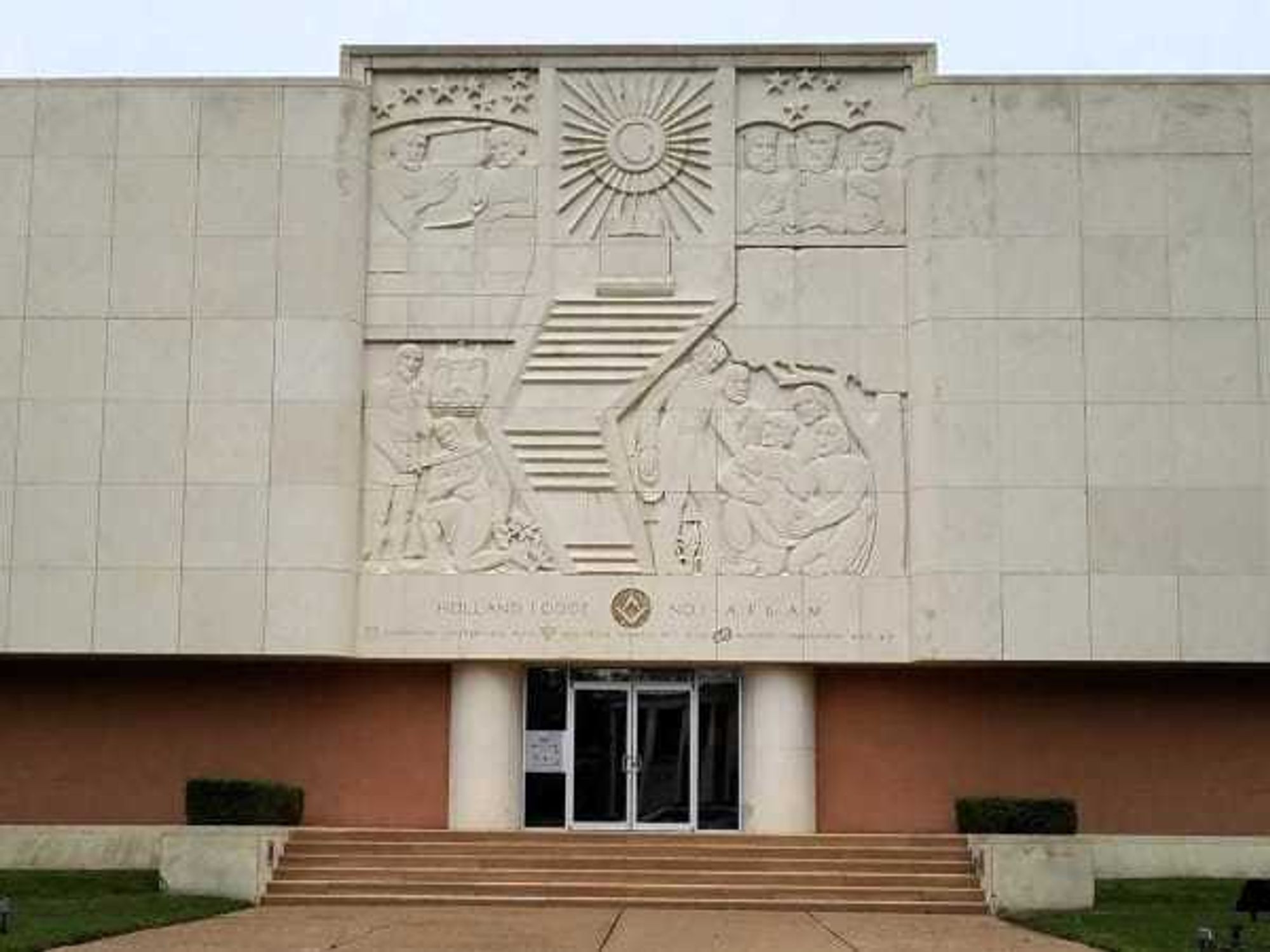
 The building at 4911 will be torn down for the new greenspace. Holland Lodge No. 1, A.F. & A.M./Facebook