a whole new world
Meet 4 artists behind Meow Wolf Houston's immersive multiverse
Move between worlds at Meow Wolf.
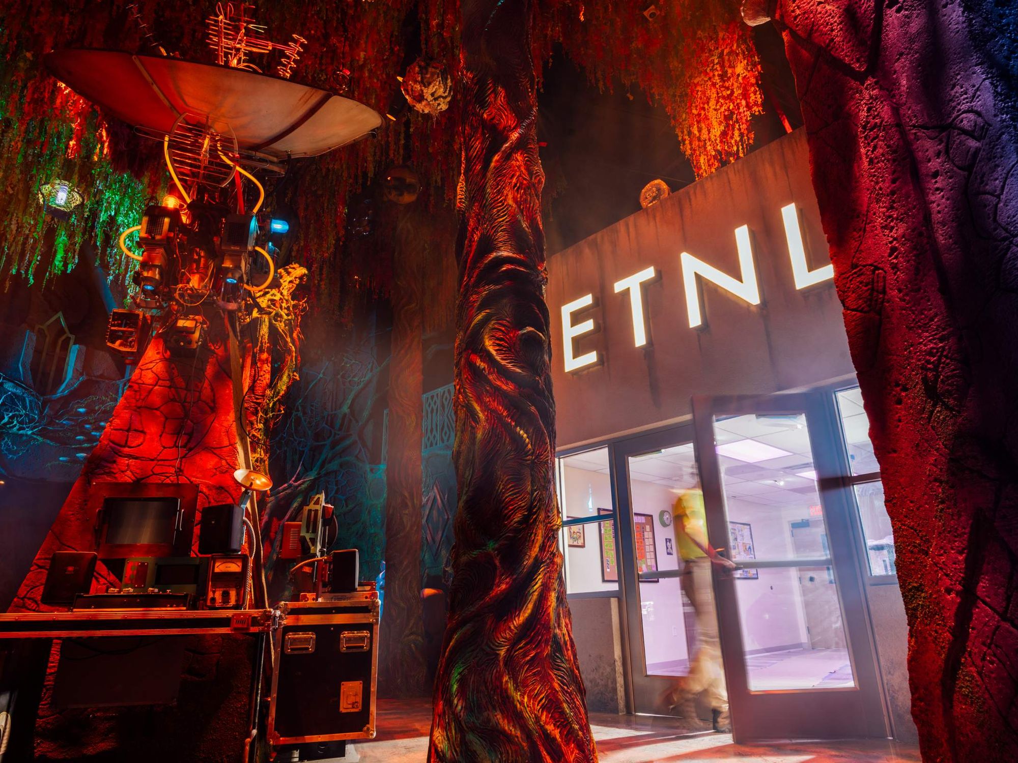
Meow Wolf — what a phenomenon! While the original location in Santa Fe, New Mexico, was once an artistic pilgrimage, people living in or traveling to more accessible cities are able to finally get a taste: Las Vegas, Denver, Grapevine (Dallas), and now Houston belong to the Meow Wolf universe. The experiential art venue will open its fifth location named Radio Tave on Thursday, October 31, expanding the story of the intergalactic takeover of community radio station ETNL in the fictional East Texas town of “Little Thicket.”
Each individual space relies on the abilities of the contributing artists, while following along with the narrative of each of the other Meow Wolf locations. But, how does that work? As with anything of this grandiose nature, someone has to be holding the reins to ensure that everything is cohesive and coherent — in terms of Meow Wolf, anyhow.
We caught up with key members of the Meow Wolf design team, including principal creative director Spencer Olsen and story editor Sarah Bradley, to understand how the historic Moncrief-Lenoir sheet metal factory became an effective, immersive experience that seems poised to become Houston’s newest must-visit art destination.
Overall Design
CultureMap: There are multiple creative directors who designed Radio Tave. Your official title is “Principal Creative Director.” What does that mean, exactly?
Spencer Olsen: What that means for my part on the exhibition as a whole is I lead and mentor the team of creative directors who each work on their individual spaces. ‘The Bailiwick’ is the one space I worked on myself rather than delegating to a staff level creative director.
CM: How did this location come to be?
SO: The historic Moncrief-Lenoir building was a pretty incredible site to get to design an experience in. Most notably, the very high ceilings allowed us to either leave some spaces full-height open to structure for a very grand-feeling experience like our front of house lobby, the ‘Amalgam,’ or add a drop ceiling below the structure for hiding MEP (mechanical, electrical, plumbing) for spaces that creatively called for a more natural or intimate feeling like ‘The Bailiwick’ and the ‘ETNL Radio Station.’
CM: Houston is a city that has always straddled industrial powerhouse and bayou-driven natural wonderland. How does this work within the Meow Wolf universe?
SO: Meow Wolf has created several natural feeling environments, and one of the creative challenges is to conceal the fact that guests are in a building, and not out in nature. For ‘The Bailiwick’ we took careful considerations of sight lines and vantage points to craft experiential reveals to guests.
We also designed a decaying sci-fi feeling structure within the space inspired by what you might encounter in an open-world video game and filled it with trees, creatures, roots, and foliage overgrown in the structure to make it feel alive and inviting.
CM: Meow Wolf has over 50 artists represented within Radio Tave. What direction does the principal creative director give to artists so that there is continuity in the overall narrative, while granting individual artistic license to local creators?
SO: Dozens of creative people worked on ‘The Bailiwick.’ In order to balance creative and narrative needs with allowing artists’ agency to make the art they wanted to make, it was important to set experience objectives without necessarily directing teams on how they should get there.
Setting an objective truth to weigh decisions against really helps artists make great choices. I remember saying frequently things like ‘it should evoke a feeling of reverence,’ or ‘tell a story of metamorphosis,’ and that worked well for a variety of disciplines from scenic painters and sculptors to lighting and audio designers.
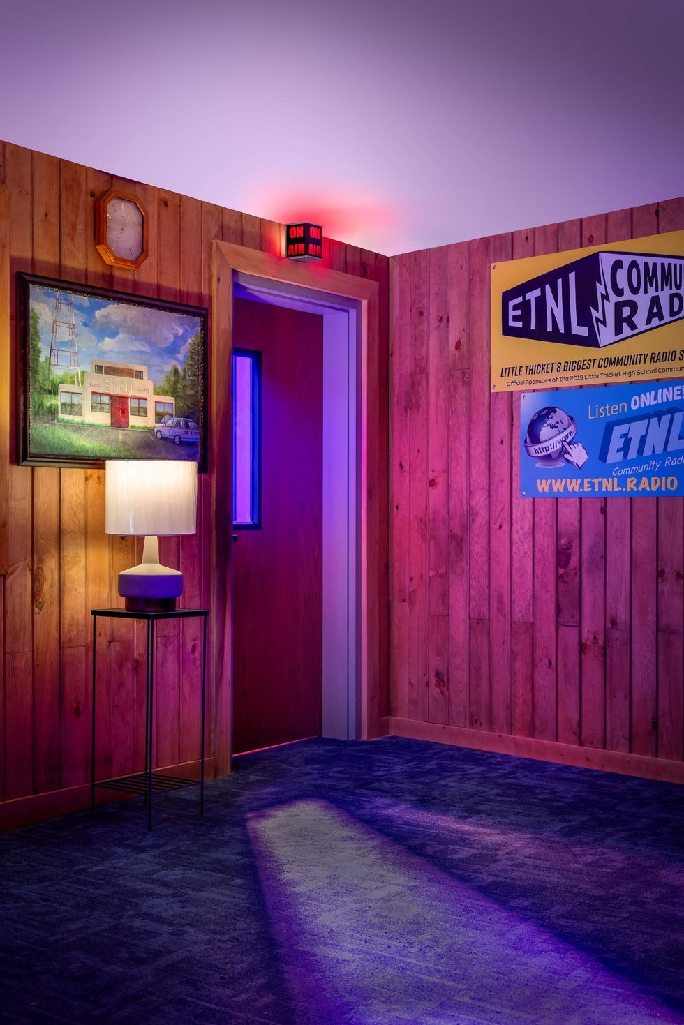
ETNL Community Radio
One of many interesting aspects of a Meow Wolf experience is that it can be as interactive as one wants it to be. For those who love a bit of mystery and detective work, an entire day can easily be spent attempting to follow all of the clues to discover what exactly happened to the employees of ETNL Radio and their fellow Little Thicket residents.
Crafting an intricately detailed story like this takes quite a creative mind. Senior creative director and story editor Sarah Bradley shared some behind the scenes trivia on how the design and storyline of ETNL Radio came to be.
CultureMap: Is the ETNL Radio station meant to be from a specific era or more ambiguous? What was your inspiration for that overall vibe?
Sarah Bradley: The ETNL Community Radio station was a massive collaborative effort, and in addition to doing the overall design of the radio station, I worked with our writers, graphic designers, and prop specialist to create the story and details that brought it to life.
Our design effort happened during Covid-19, so we relied largely on photographs. The website Radiosurvivor.com has an impressive archive of radio station tours done by Jennifer Waits, and her photography was invaluable for us to capture a vibe and aesthetic that celebrated these.
CM: What was the design process?
SB: The design process took inspiration from a number of sources, which then informed the design of the story, visuals, and other elements. The building facade, for instance, was inspired by the beautiful 1940s architecture of WPFT in Raleigh, NC, which in turn led us to establish ETNL's roots in the late 1940s.
CM: What is the story of Little Thicket?
SB: Though the story would be set in the present, we wanted the interiors to look dated, like renovation hadn't happened in a while, or happened unevenly across the building. We juxtapose the older interior with contemporary items and photographs, as well as an archive of historical photographs and newspaper articles capturing the history of the radio station throughout the decades.
This deep history also led us to develop the town that ETNL was originally from, a small town in East Texas called Little Thicket. Being a community radio station, ETNL's ties to this quirky town are seen throughout the decor and help create a sense of place for us to break later when it's revealed that the station is no longer in Little Thicket.
The Amalgam
Radio Tave’s main lobby, aka “The Amalgam,” is a pastel dreamscape. Soaring ceilings and windows allow for so much natural light that, as a canvas, this space will always impress. Dani Herrera, the creative director for front of house, shared more about that experience, and what visitors should make sure not to miss.
CultureMap: As the creative director for “The Amalgam,” what do you feel are some cool design elements of that space that people wouldn’t know from just being in there?
Dani Herrera: Some cool design elements that first come to mind are murals, the underfloor diorama, mobiles, and the faux stained glass window.
We really wanted murals by local Houston artists to be one of the first things visitors see when entering the lobby. Lobby murals were designed and painted by nine different Houston artists and one Meow Wolf artist.
Below the stained glass window, we have a recessed underfloor diorama. The recess was part of a load-in area for trains when it was a former sheet metal factory. The stained glass window and mobiles add another layer of interest by casting their color and light across the space — most brilliantly closer to sunset.
CM: What was it like from your perspective to make sure that each of the nine designers were represented, while staying within a cohesive aesthetic?
DH: Early on in the project, I put together a creative deck with mood boards, a base color palette, concept art, and lots of 3D views. It served as a shared starting point for artistic collaboration and considerations.
In the lobby, there’s an incredible range of artists, specialists, designers, and fabricators, etc. I wanted to create elements and an environment that offered a lot of range and interest for different types of artists. I hoped this base palette would provide enough cohesiveness that artists could have more range to create from their unique sensibilities and aesthetics.
CM: The murals in the Amalgam begin approximately seven feet above the floor, with the wall space below painted in a colorful checkered pattern. You mentioned previously that it’s a trick to keep the murals from being damaged, hiding practicality in your design. Are there any other tricks like that happening in the lobby?
DH: In the front of house spaces there’s a lot of balancing and blending of aesthetics with operational/ functional and budgetary needs. Placing the murals above eye level was meant to draw your attention up to further add to the grandeur and volume of the space and decrease the need for maintenance on the murals.
Another example is how we managed to conceal operational doors following some of the planning principles of a piazza or courtyard. We have a central open and wide space for circulation symmetrically surrounded on both sides with smaller lingering spaces that mask the operationally-required doors and pathways.
One to Watch
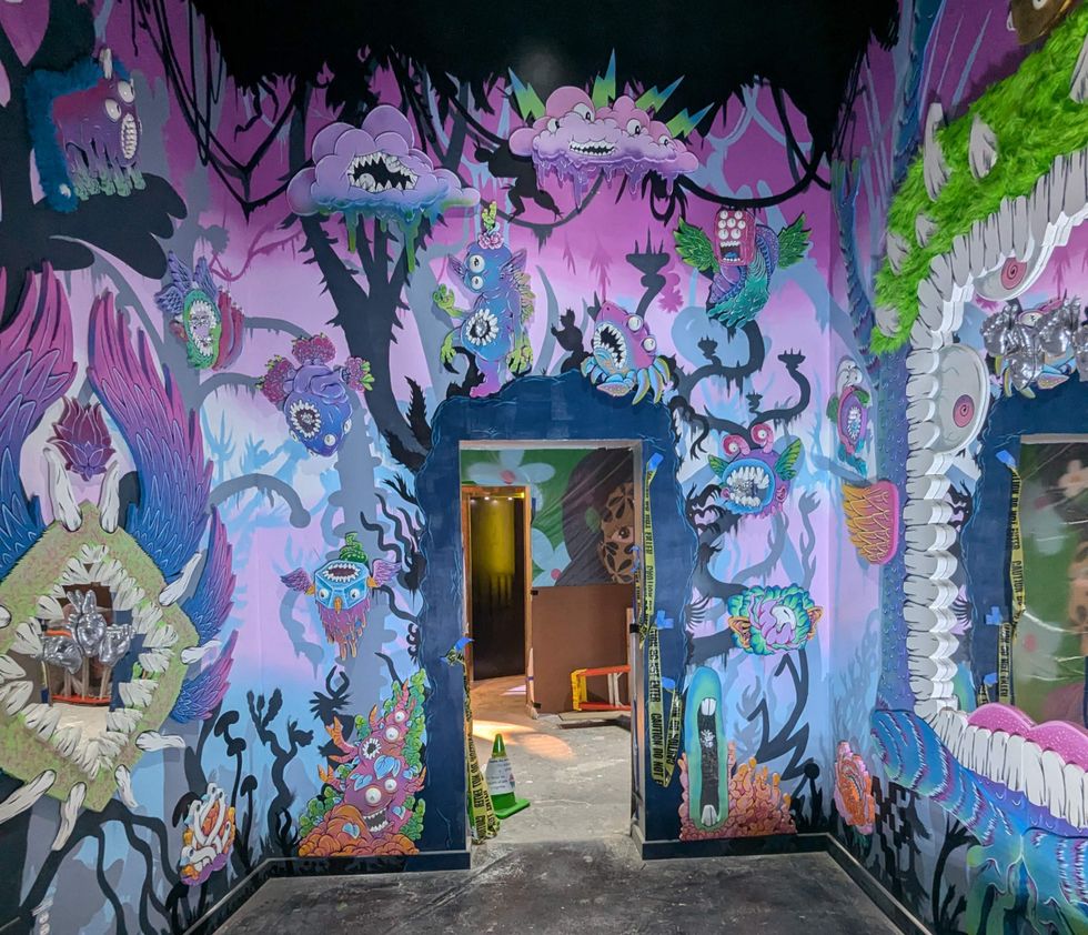
Those who appreciate ’90s nostalgia will be pleased to know that Houston artist Neon Thrash has an installation that will set any millennial’s heart aflutter. Named “Speaking In Reflections,” this artist’s installation is also one of the only installations that includes a mirror — one simply must be allowed a selfie. Neon Thrash shared some insights into his inspiration for the room.
CultureMap: Your characters and cartoons are so familiar, and their features are very nostalgic of the ’90s. Was that intentional?
Neon Thrash: A lot of my work comes from inspirations I don't realize I'm tapping into until after I've finished a piece. It's like using paper that has imprints from previous writing you didn't see at first. Nickelodeon cartoons really left a mark as I got older, so unique and full of artistic style. They were new and fresh compared to a lot of Saturday morning cartoons. Ren and Stimpy, Ah! Real Monsters, and Rocko's Modern Life were all very formative for me.
CM: What is your overall goal with “Speaking In Refections?” Do you think it will resonate with visitors in a positive way? Your characters have found themselves to be equally scary, charming, and adorable.
NT: We look at real life all day. What appeals to me are things I would never be able to see, the weirder the better. Illustration lets me bring to life creations that have no purpose other than to make me and, hopefully, other people smile. I really want to bring people back to that joy of falling in love with new cartoons when they were growing up. It's even more awesome if I can recreate that as a shared experience for people with their kids.
Radio Tave is an unbelievably majestic experience that really has to be experienced to appreciate. With the rate that the Meow Wolf universe is expanding, fans may eventually request an intergalactic passport. Just be sure to get it stamped in Little Thicket.


